Transform Your Project Dashboards with Power Apps

Data-Driven Efficiency on the Power Platform
Watch a recorded webinar about how you can optimize project reporting with Power Apps and Power BI.

What is Microsoft Power BI?
Microsoft Power BI is a business analytics service that provides interactive dashboards and reports, making it easier for organizations to analyze and understand their data.
Key Features of Microsoft Power BI
It connects to various data sources, such as Excel spreadsheets, cloud-based and on-premise sources, and other various databases. It also offers a range of tools for data preparation, transformation, and modeling.
The platform is popular for its user-friendly interface and powerful visualization capabilities, enabling users to create compelling and informative reports.
Power BI is widely used for business intelligence and data analysis and helps you make data-driven decisions across various industries. It can be especially useful in reporting across portfolios of projects.
4 Power BI Project Management Dashboards
These project management dashboards give senior executives and PMO leaders complete and real-time visibility across the project portfolio, including:
- My Work Dashboard
- Portfolio and Project Dashboard
- Project Documents Dashboard
- Resource Utilization Dashboard
Each dashboard is packed with valuable information and offers easy filtering. Project Managers, PMOs, and senior executives will find them highly useful for managing projects.
Data-Driven Efficiency on the Power Platform
Watch a recorded webinar about how you can optimize project reporting with Power Apps and Power BI.
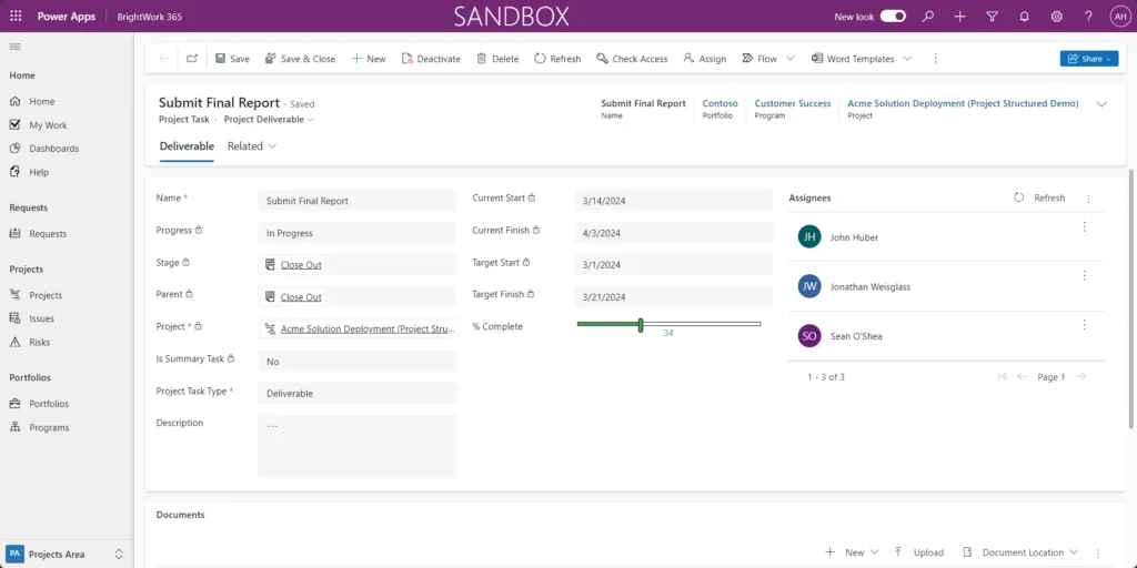
1. My Work
The My Work dashboard in Power BI displays a list of action items assigned to the logged-in user.
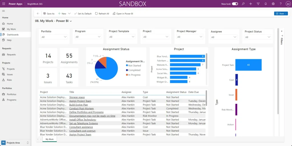
It shows Actions, Tasks, Risks, and Issues across all projects you’re working on. When you click on an item, like “Storage space,” it opens in a new tab.
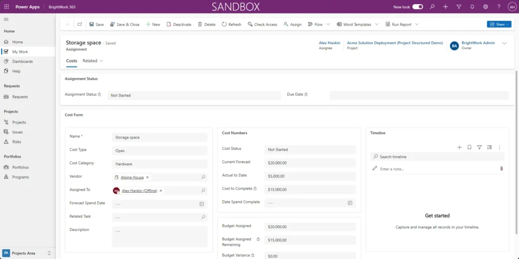
You can then view task details and make updates, such as adjusting the percent complete or adding an approver.
Note that the dashboard doesn’t update automatically. Data refreshes occur when Power BI pulls a large portion of your Dataverse. This refresh can be scheduled to occur up to eight times a day.
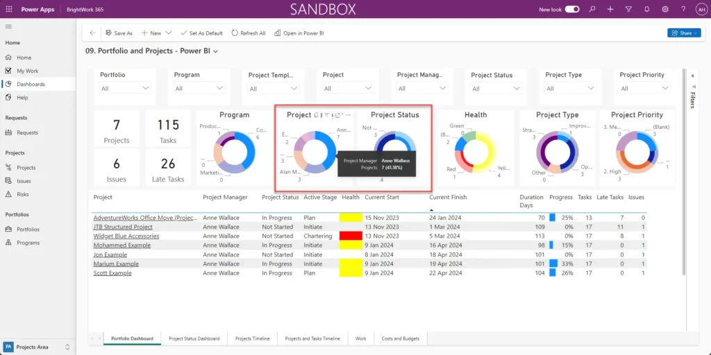
2. Portfolio and Projects
Project managers will spend a lot of time here, as it provides a comprehensive view of the entire project portfolio.
The Portfolio and Projects report includes six built-in reports:
Portfolio Dashboard
The Portfolio tab provides a top-down view of all projects across all portfolios.
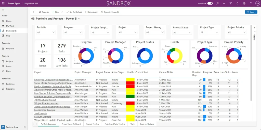
You can filter the projects using any of these eight slicers up across the top.
For example, selecting the Marketing program from the dropdown will display only those projects.
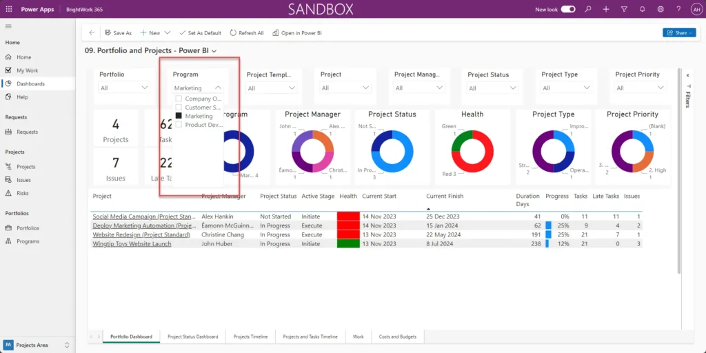
All of these visualizations are interactive as well. For example, clicking on a Project Manager’s name in the chart will show all projects assigned to them.
Clicking it again restores the full dashboard view.
Project Status Dashboard
The Power BI Project Status Dashboard displays a single project in a great amount of detail. It shows the first project in the list by default, but you can select any project to view.
For example, we’ll open the “Widget Blue (New Product Introduction)” project.
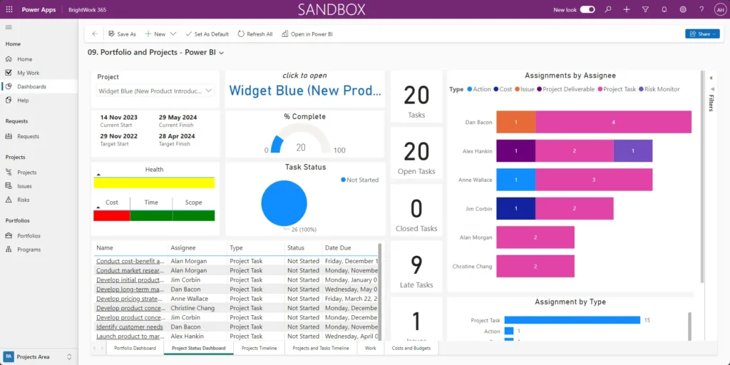
This dashboard offers a comprehensive overview of the Social Media Campaign project and the project’s progress. It includes the following information:
- Project timeline information
- Percentage complete
- Key performance indicators
- Task statuses
- Task metrics
- Assignees
- Task types
You can interact with the visualizations to filter and focus on specific details relevant to your needs.
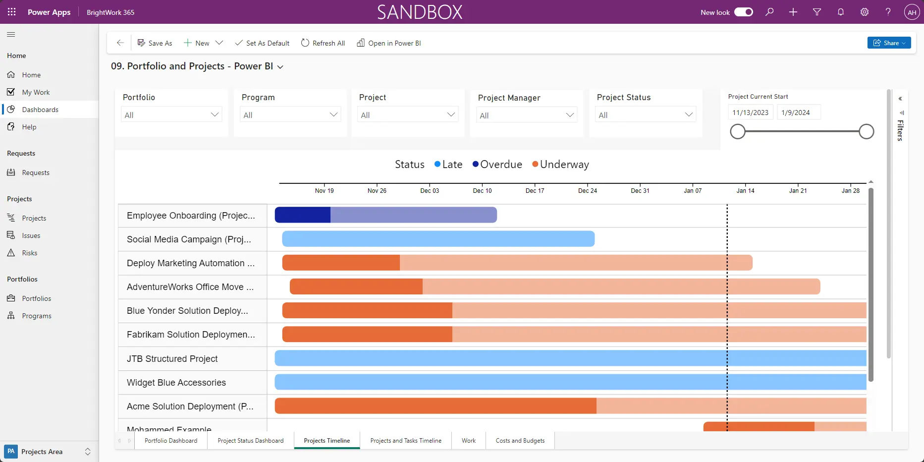
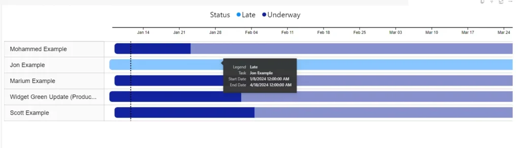
Projects Timeline
Now, let’s jump to the third tab – Projects Timeline. It provides a simplified Gantt chart view of your projects.

By default, it displays all projects across portfolios. Again, we have the usual slicers up top. There are five familiar slicers: Portfolio, Program, Project, Project Manager, and Project Status.
Additionally, a Start Date slicer lets you view projects that started after a specific date, such as January 1, 2025.
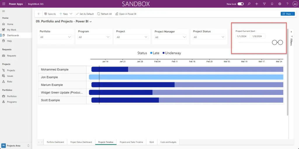
When hovering over the handy little CSS, you’ll see additional details, including the Start Date, End Date, and Percentage Complete.
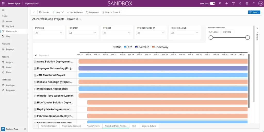
Projects and Tasks Timeline
The Projects and Tasks Timeline is similar to the previous tab but focuses on a simplified Gantt chart of project tasks.
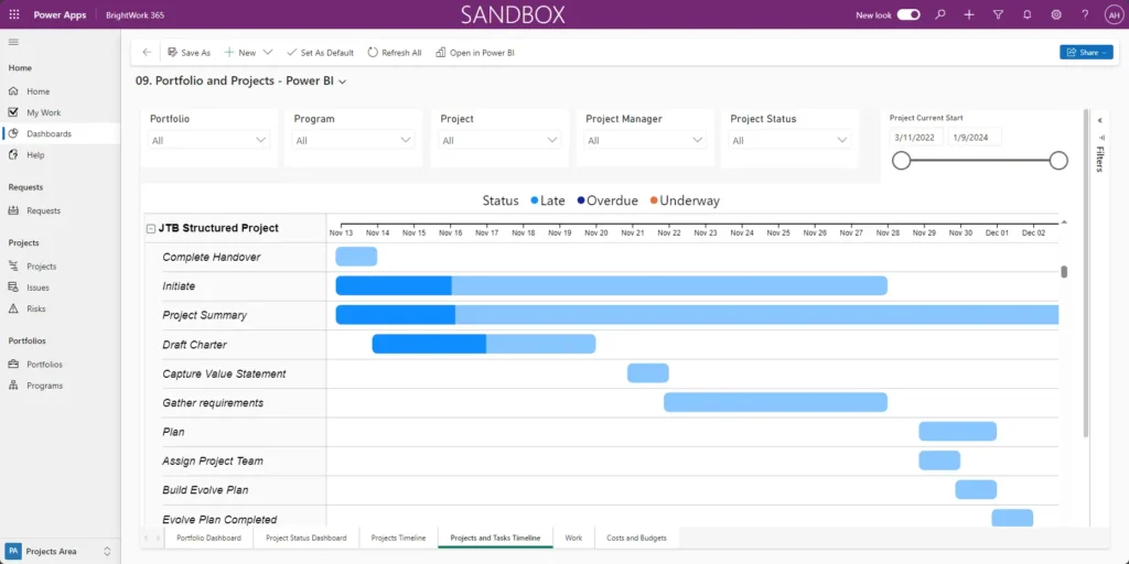
So you can see that each project here is expanded, but there is an option to expand and compress all of them.
The familiar slicers and the current start date slider are available, along with task details visible on hover.
Work
The Work tab shows all assignments across projects.
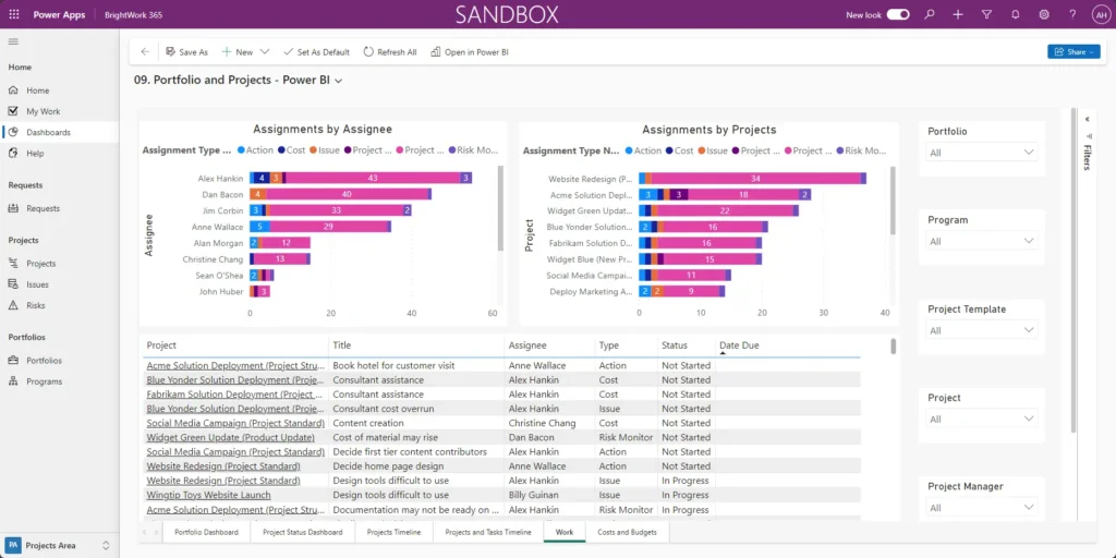
Again, it features familiar slicers on the right-hand side. Using the interactive chart, you can look at issues assigned to Alex, for example.
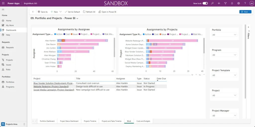
Click on any Issue to view the details and access the work item in BrightWork 365.
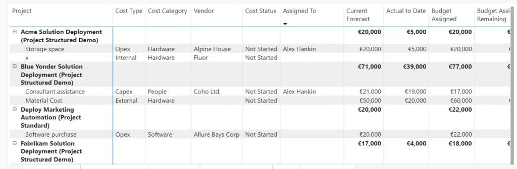
Costs and Budgets
The final tab in the Portfolio and Projects dashboard is Costs and Budgets. Again, there is a pretty familiar interface within Power BI with slicers and clickable view filters.

In this example, we’re working in Euros, but this report can be adjusted to display your regional currency, like the US dollar, Japanese yen, etc.
This report allows you to drill into each project and see the specific cost items, including forecasts and assigned budgets.
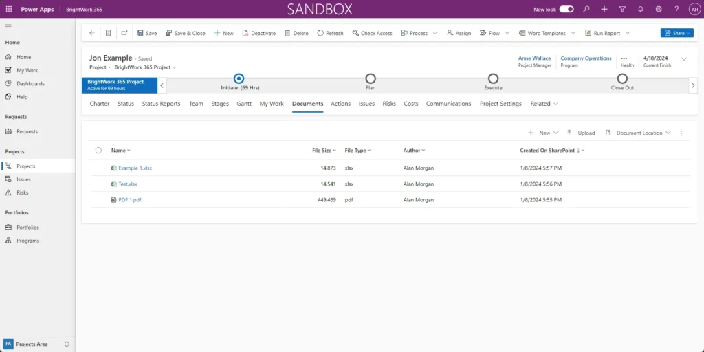
3. Project Documents Dashboard
The Project Documents dashboard in BrightWork 365 consolidates all project documents in one place, making it easier for project stakeholders to access them.
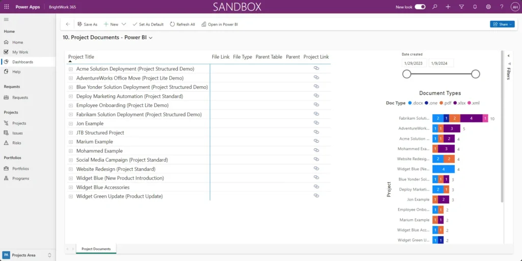
In the Documents tab of the Jon Example project app, you can view documents attached to the project.
Without this dashboard, a project manager or PMO lead would need to navigate through each project individually, which can be time-consuming.
The dashboard aggregates all documents across projects. You can expand the project row to see the saved documents for each project.
You can see the same business document and demo Excel file that we saw in the project app itself.
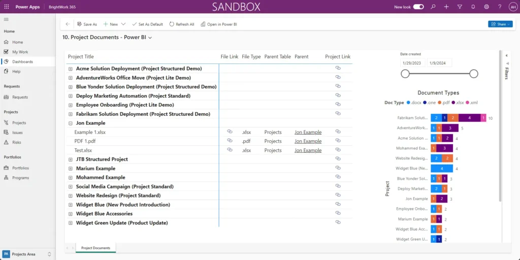
And then, of course, we can see additional details, such as
- the parent project,
- the document type,
- and a link that will act as a download link.
Instead of opening the document in Excel or Work Online, it will automatically download. Alternatively, you can click the project link to open the document online.
4. Resource Utilization Dashboard
Last but not least, we have the Resource Utilization dashboard. It provides detailed, actionable insights into personnel availability across project portfolios.
Senior executives and PMO leaders can quickly assess resource allocation and identify areas requiring adjustments.
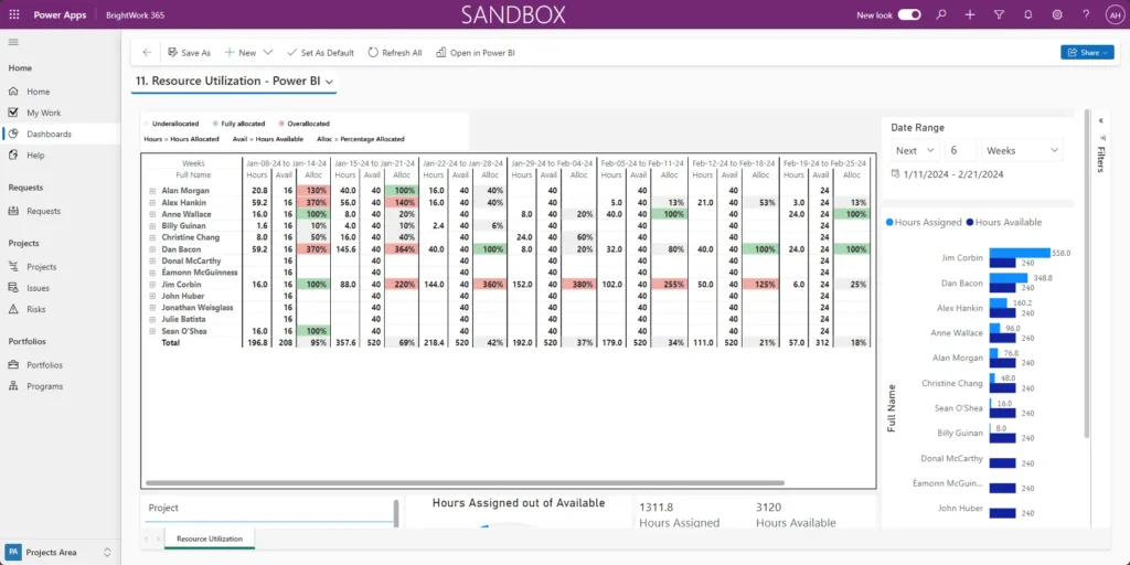
Resources are categorized by available hours and hours allocated to tasks. For example, to focus on the next four weeks, you can enter “4” in the date range field at the top right and press enter. The dashboard will then display data for that specific time frame.
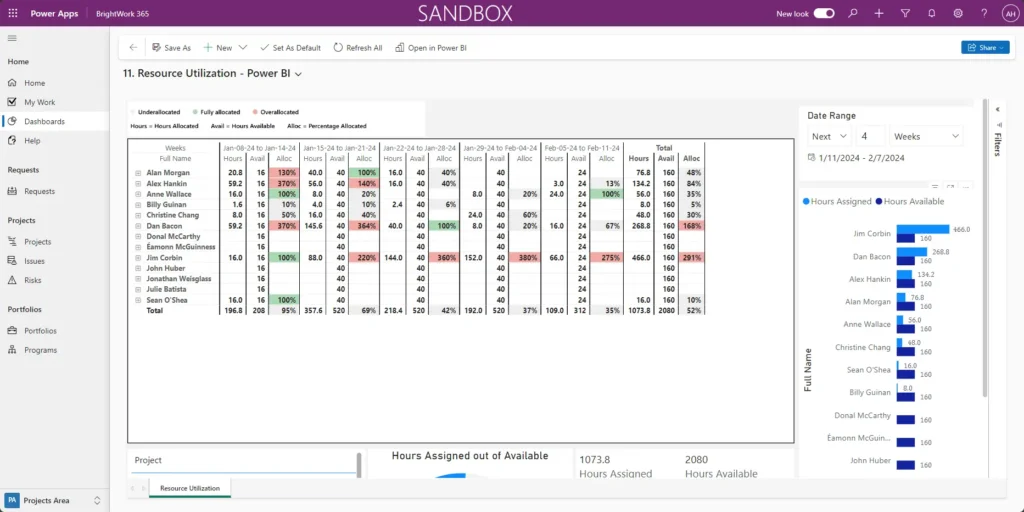
For each period, you can see the following:
- The hours allocated
- The hours available in that week
- An indicator as to whether a resource is under or over-allocated.
Green represents ideal allocation, with team members operating at 100%. So, we know that everybody has the required amount of work to accomplish the PMO goals. Red means the resource is over-allocated, and gray indicates under-utilization.
If a team member, such as Christine, is allocated at 140%, this signals an excessive workload. For instance, Christine’s total hours (16, 16, and 12) exceed her 32-hour capacity by 12.8 hours.
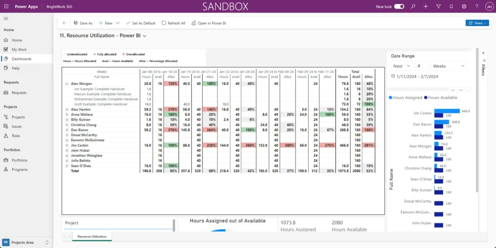
To resolve this, redistribute her workload by reducing allocation on specific projects or assigning excess hours to other team members.
Configure Power BI Dashboards for Your Needs
You can, of course, have us build custom dashboards to meet your specific reporting needs. If you have a Power BI expert on your team, you can design tailored dashboards internally.
We also offer the option to customize dashboards for unique project management needs or to include specific KPIs not covered in our standard options. These enhancements can help you achieve greater project success.
Data-Driven Efficiency on the Power Platform
Watch a recorded webinar about how you can optimize project reporting with Power Apps and Power BI.